MATH 427: Class Imbalance
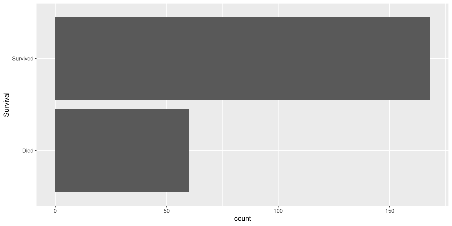
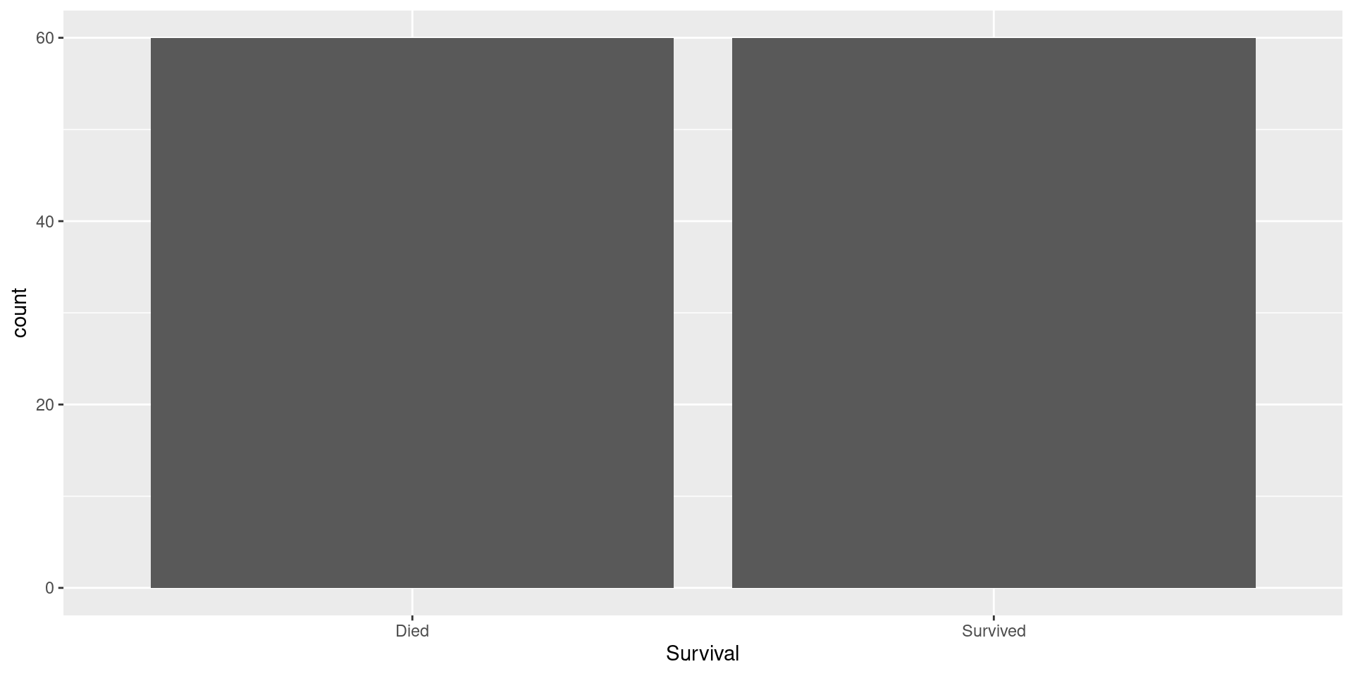
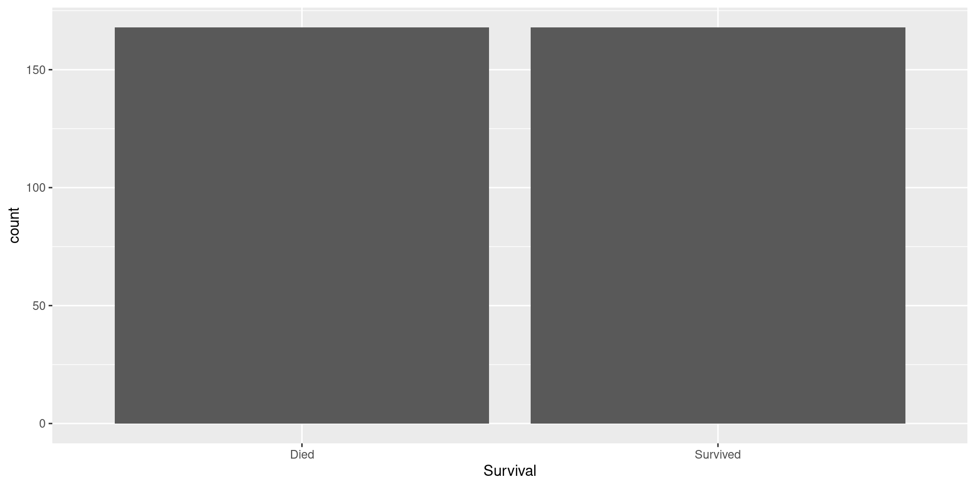
Visualizing Response
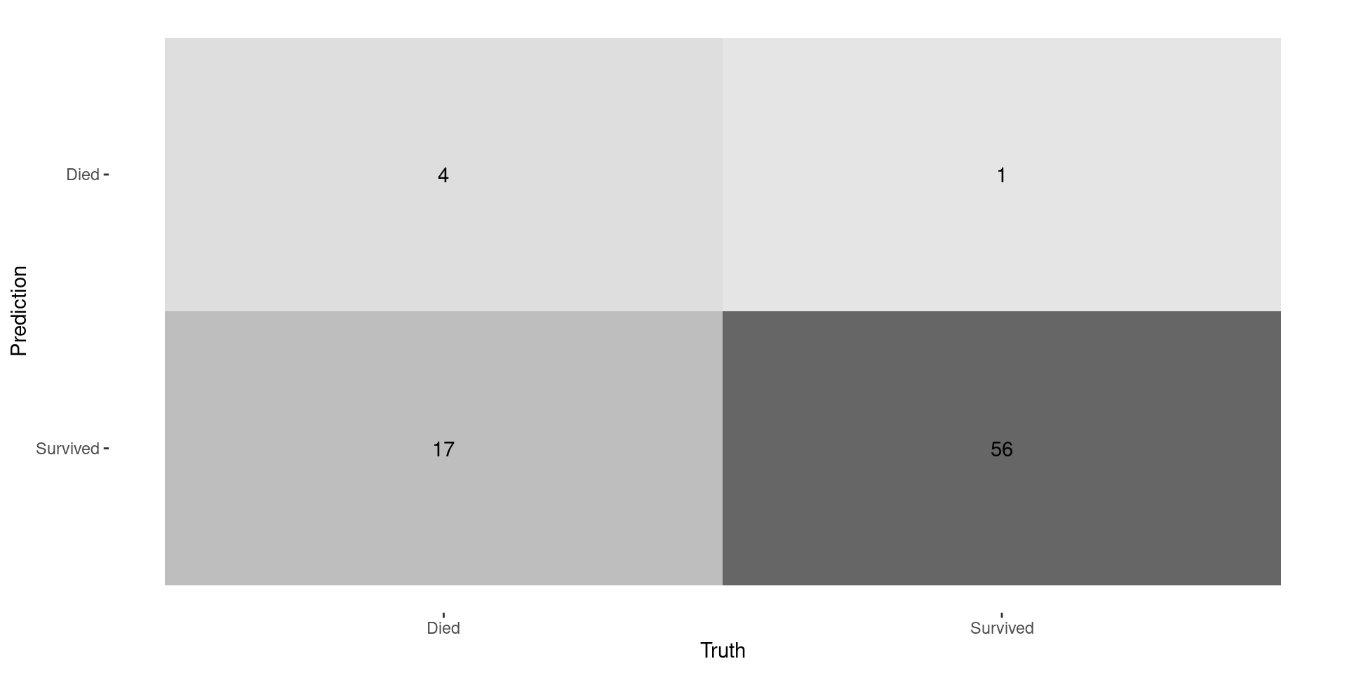
Confusion Matrix
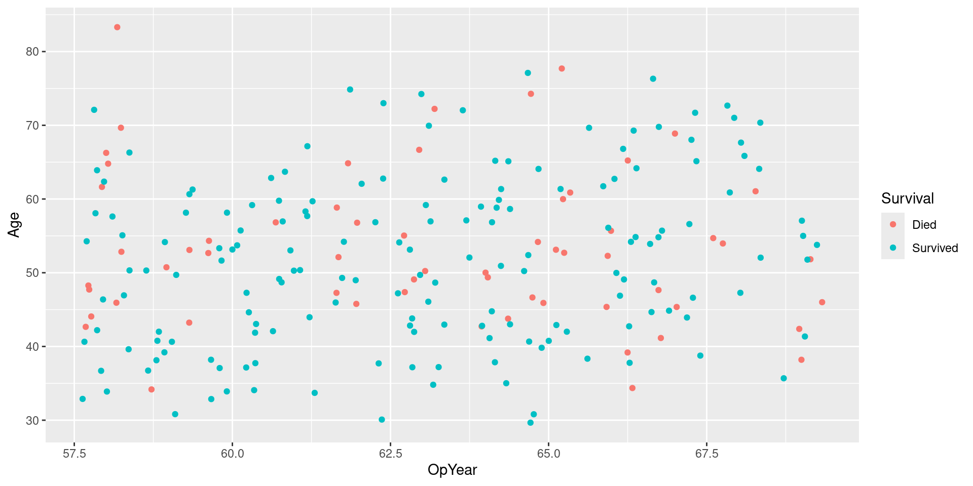
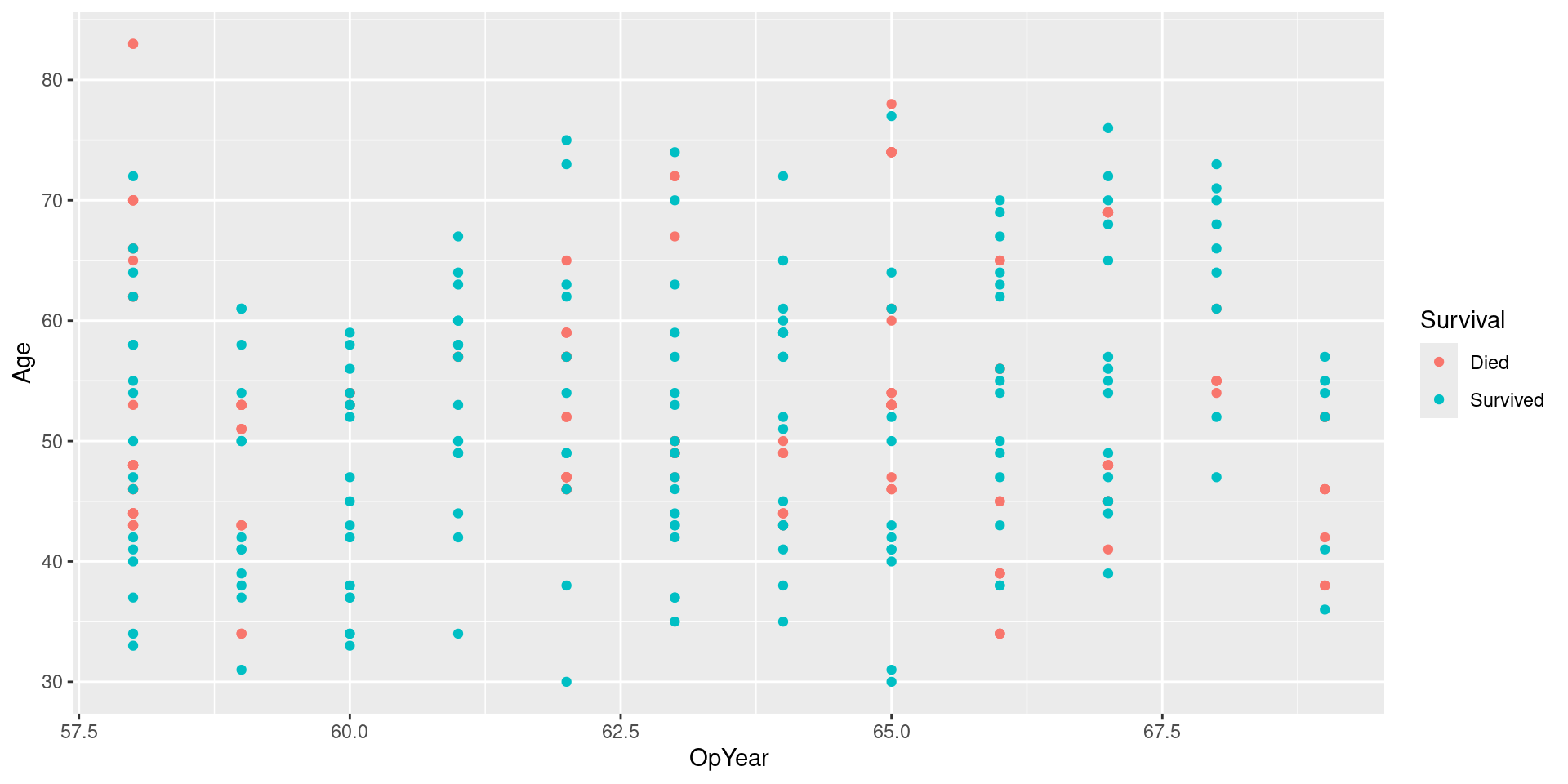
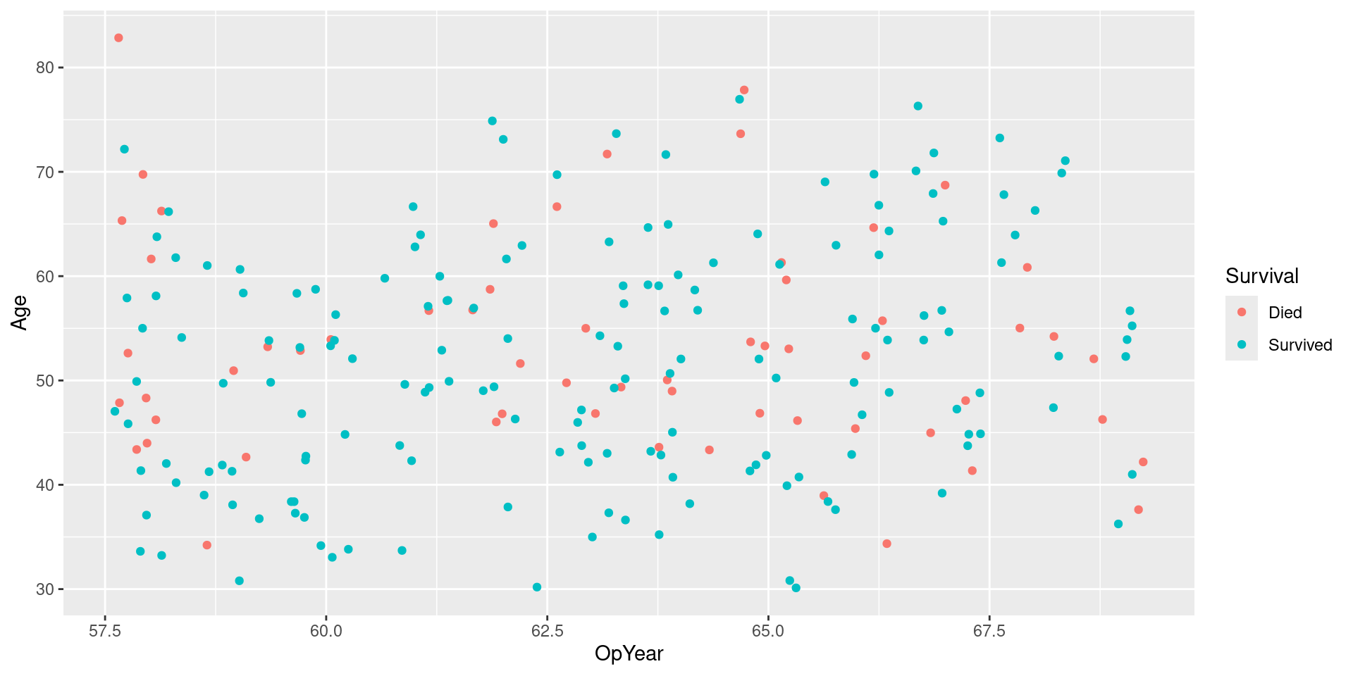
Visualizing Data
Upsampled Data

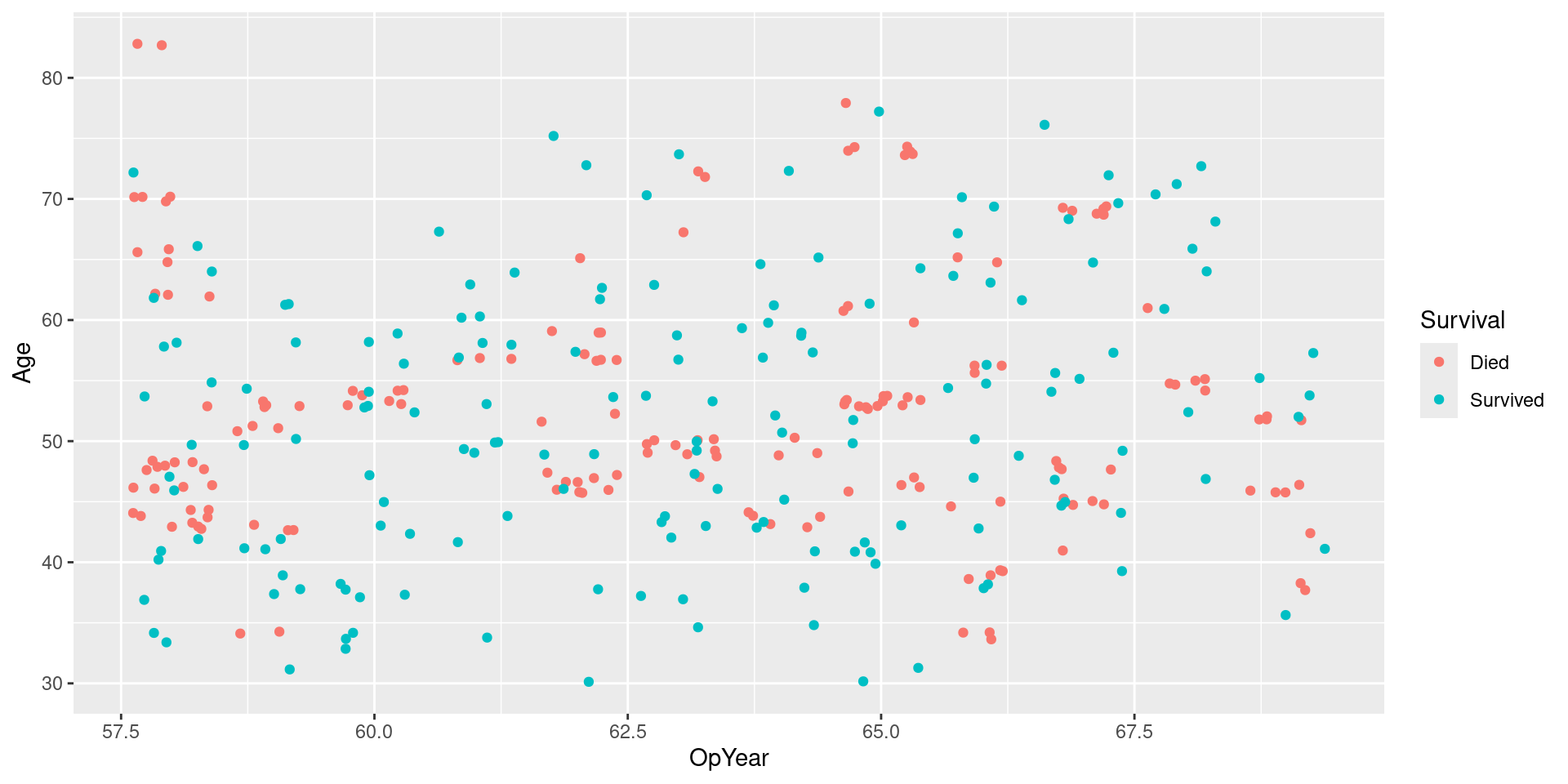
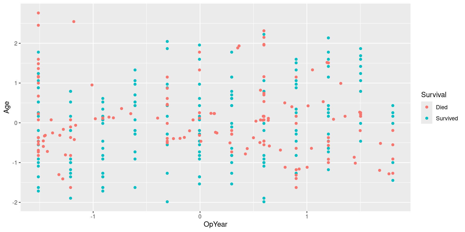
Visualizing Upsampled Data
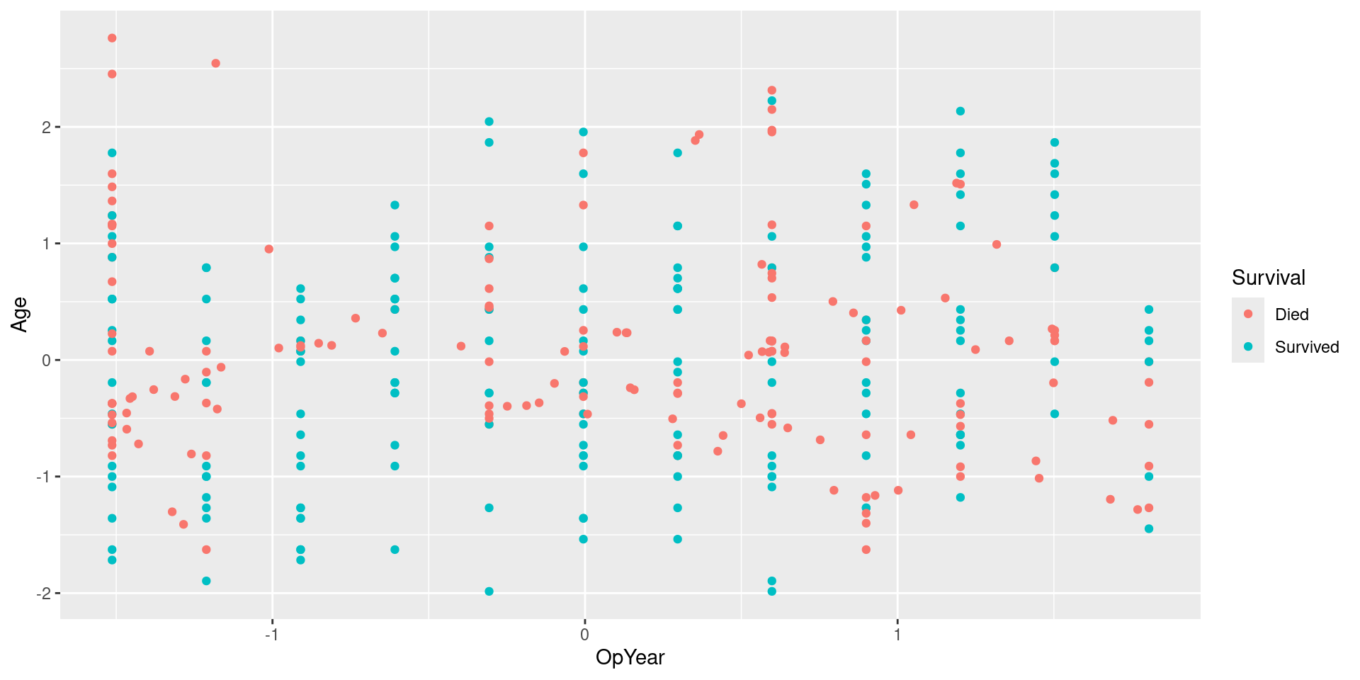
Visualizing Upsampled Data: No Jitter
Visualizing Data

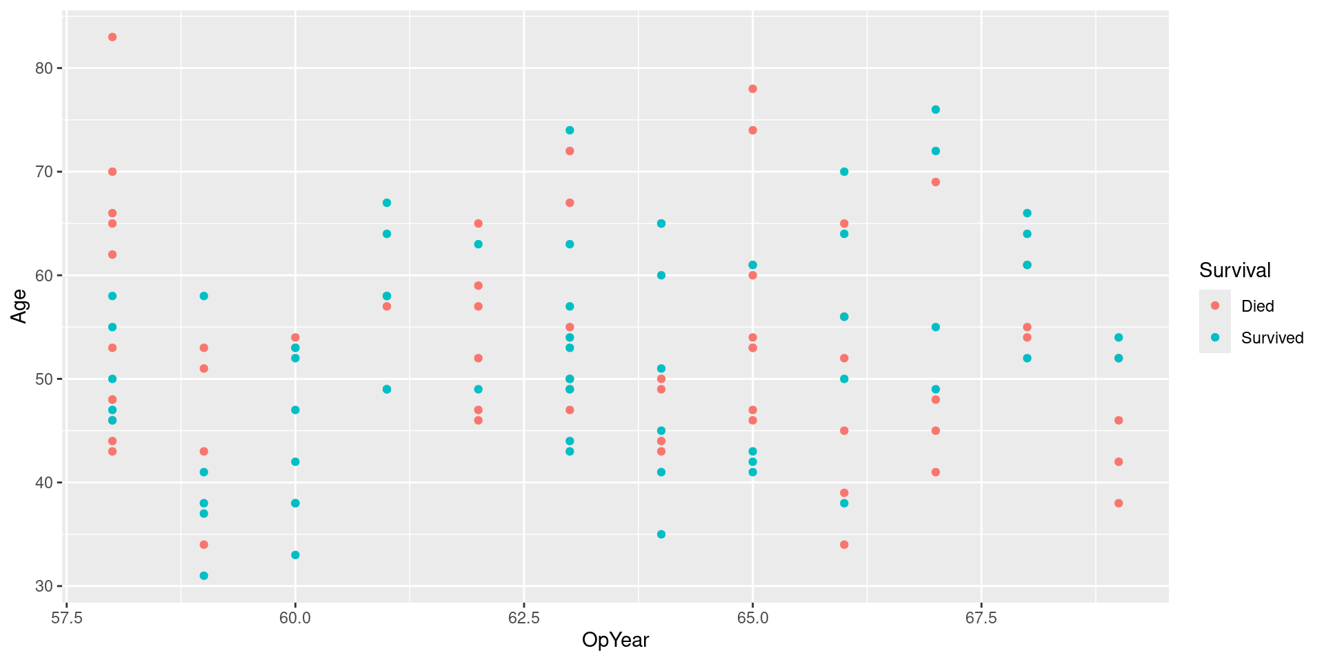
Downsample Data
Visualizing Downsampled Data
Visualizing Downsampled Data: No Jitter
Visualizing Data
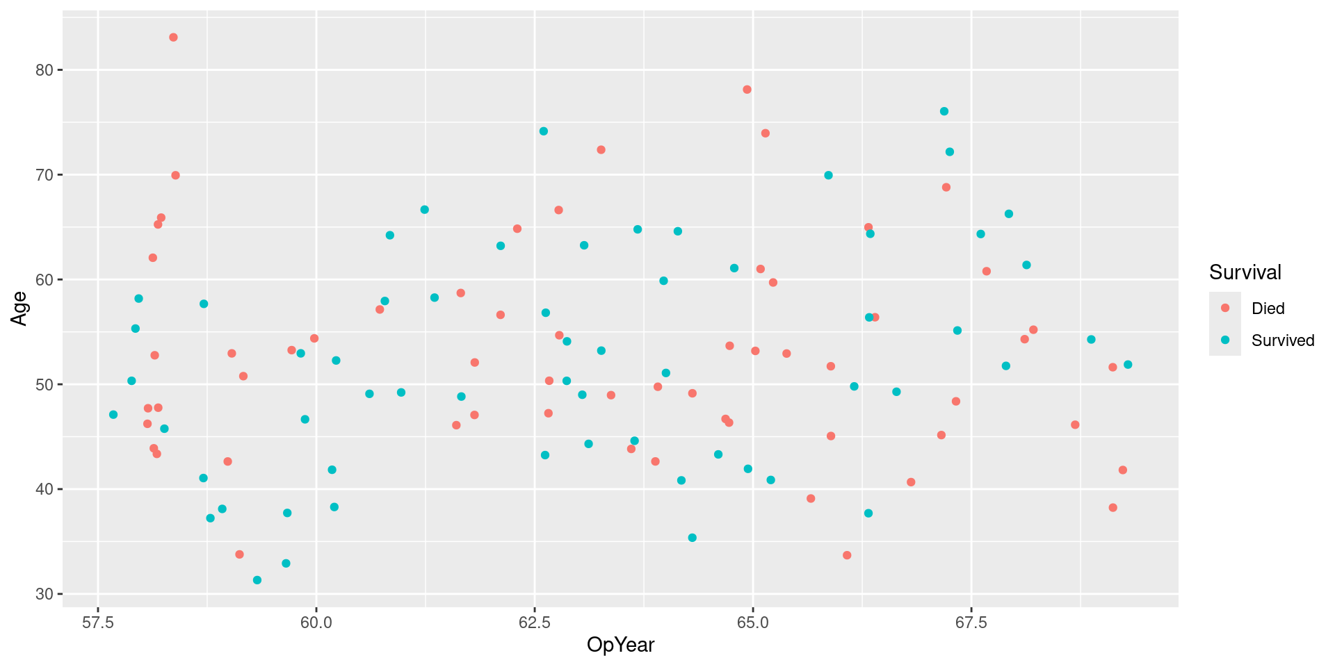
SMOTE Data
Visualizing SMOTE Data
Visualizing SMOTE Data: No Jitter
Evaluate Performance
| .metric | .estimator | .estimate |
|---|---|---|
| accuracy | binary | 0.7692308 |
| precision | binary | 0.5714286 |
| recall | binary | 0.5714286 |
| .metric | .estimator | .estimate |
|---|---|---|
| accuracy | binary | 0.7435897 |
| precision | binary | 0.5217391 |
| recall | binary | 0.5714286 |
| .metric | .estimator | .estimate |
|---|---|---|
| accuracy | binary | 0.7435897 |
| precision | binary | 0.5217391 |
| recall | binary | 0.5714286 |
![]()